New York’s Income Tax

Part 2 – Do Progressive Income Tax Policies Reduce Inequality?

Do the scales of Justice favor Progressive Income Taxation?

Introduction

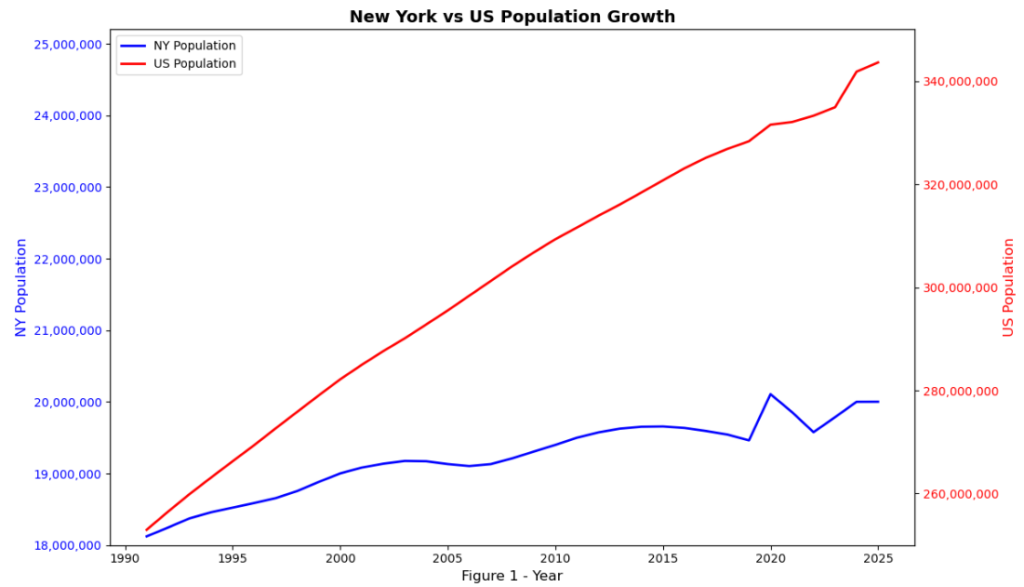
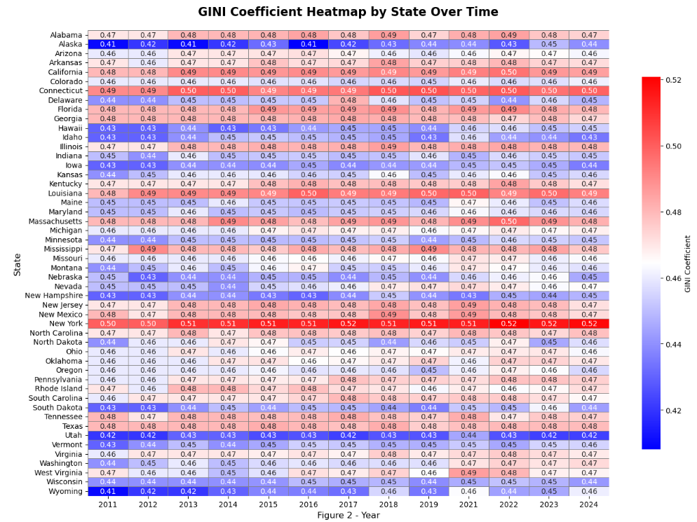
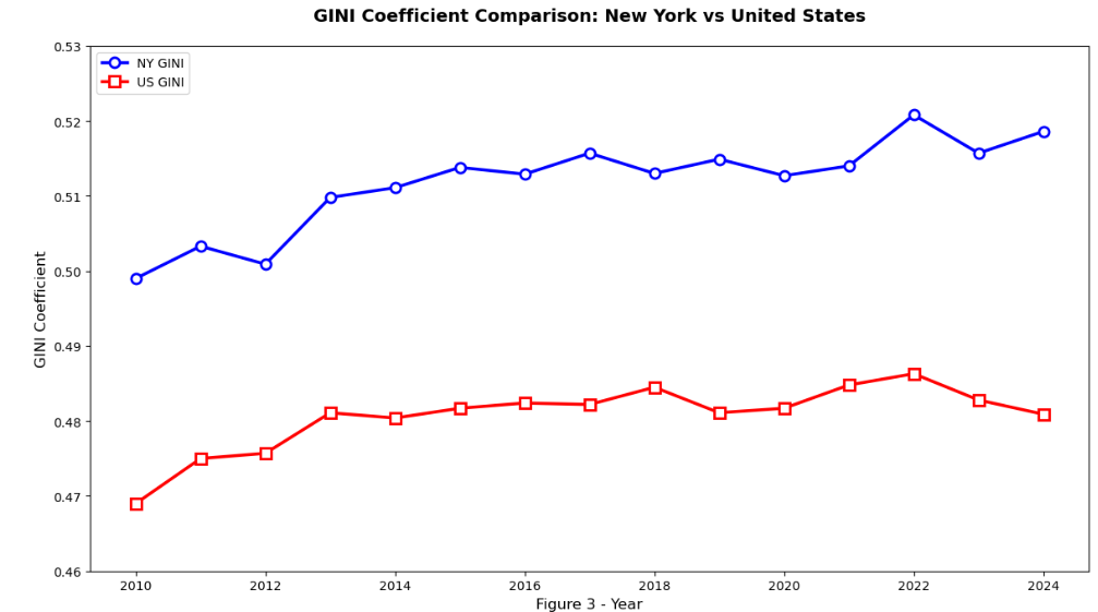
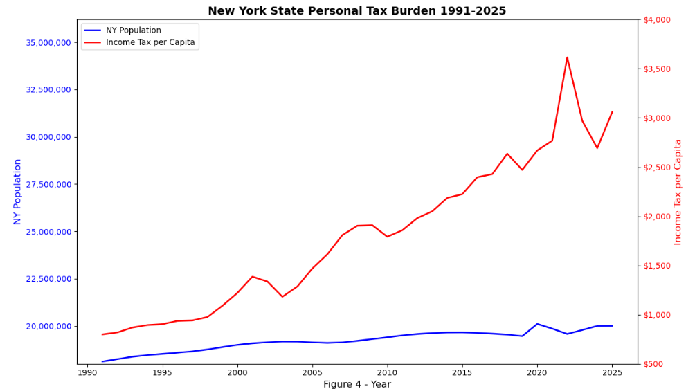
In a 2022 speech, Governor Kathy Hocul (D-NY) said, “Just jump on a bus and head down to Florida where you belong, ok? Get out of town, get out of town because you don’t represent our values, you are not New Yorkers” which at the time was met with cheers and standing ovation. Now, in 2026, Governor Hochul is saying “..cut me the checks if you want to be supportive but maybe the first step should be go down to Palm Beach and see who we can bring back home because our tax base has been eroded”. As discussed in part one, New York has been on a 50 year de-population trend that has spanned multiple administrations and under Governor Hochul’s time as governor and despite a tax base that is not growing proportionally to the rest of the country, income taxes collected have increased may times more than inflation and inequality has increased faster than the rest of the United States. New York is now ranked the 50th (the worst) state in the country for income inequality according to data from the official US GINI Coefficient data and the gap is getting wider over time while nationally, income inequality is decreasing. Is Progressive Tax Policy that bad? Do other states with Progressive Tax Policy fair better?

Data and Methodology

2025 Top Tax Rate Data and Tax Type (Zero, Flat, Progressive) was collected via individual internet searches and published polices from Intuit (makers of TurboTax, not a paid sponsor) and compared with 2024 published GINI Coefficients.

Results

A comparison of the distribution of inequality (GINI Coefficients) in Figure 1 below shows that the distribution of scores in all three groups of tax structures is similar and are approximately normally distributed (black-dashed line). There was no evidence of a difference in the means of inequality scores in the three groups (Test 1, One-way ANOVA Test F=0.9087 P-value: 0.4100)

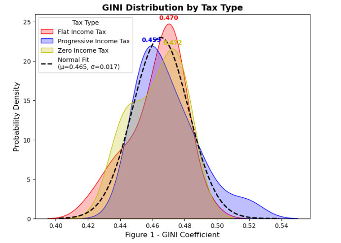
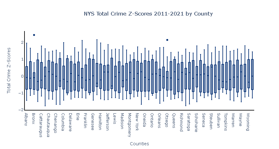
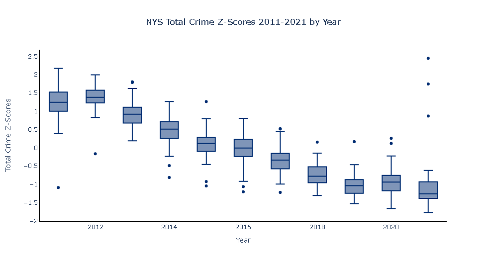
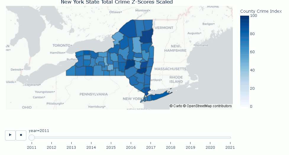
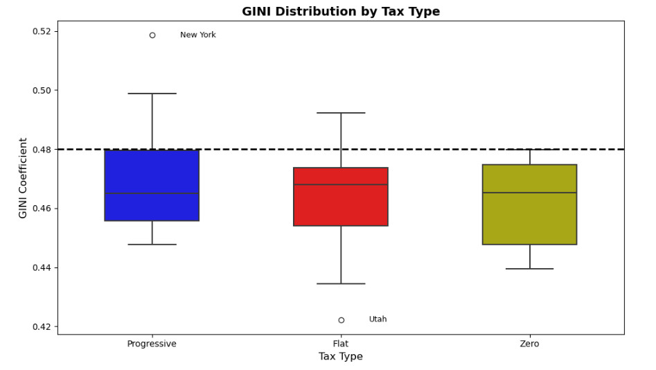
Figure 2 below is a secondary comparison using a Box and Whisker Plot with a line drawn at GINI = 0.48 to visualize where states with higher-than-average inequality are distributed. The medians of inequality in each group are also similar; however, there are more high-inequality (GINI >= 0.48) states in Progressive Tax States, in number, proportion, and depth of inequality. A one-tailed Z-test of the proportion of high-inequality states in Progressive Tax States (PProgressive= 27.78%) versus proportion of high-inequality states in Non-Progressive Tax States (PNonProgressive =6.25%) (Test 2) yielded a result of Z=-2.1058 (P-value: 0.0176) indicating there IS evidence of a higher proportion of high-inequality states in Progressive Tax States compared to Non-Progressive Tax States with New York being the highest inequality in the country as discussed in

Part 1 and shown below.

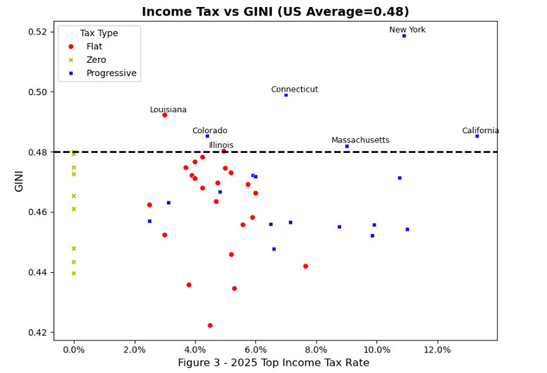
Lastly, Figure 3 compares the Top Tax Rate and Inequality. Again, a line is drawn at GINI=0.48 (National Average) to further look at high-inequality states. A third statistical test was performed by analyzing the proportion of high-inequality states after splitting the groups into high tax (Top Tax Rate above the median 4.785%) and low tax rates (Top Tax Rate below 4.785%) and the proportions were 20.8% and 7.69% respectively; however, the Two-Sample Z-test for their Population Proportion did not indicate a statistically significant difference (Z=-1.227, p-value=0.2214)

Conclusions

Sadly, states with Progressive Income Taxation are not fairing better than New York. There is evidence to disprove Progressive’s claim that Progressive Income Taxation reduces income inequality (measured by GINI). Across the United States, the distributions of income inequality in Zero Income Tax, Progressive Income Tax, and Flat Income Tax States are similar to each other (Figure 1) with no difference in the average inequality in the three groups (Test 1). There is evidence that Progressive Income Tax States have a higher proportion of high-inequality states (Test 2) and 5 of the 7 states with the highest total inequality (Figure 3). There is a positive correlation of Top Income Tax Rate with Inequality; however, there is no evidence of a statistical difference in the proportion of high-inequality states in high top tax rate states versus low top rate tax states (Test 3). This is one small view into a portion of the taxes paid by individuals and one economic metric. This doesn’t completely answer the question on if Progressive Income Taxes “work”; however, this is an indicator that states with Progressive Income Taxes have are more likely to have problems with inequality and do not perform as their proponents claim.

About the Author

Sam Sanfratello Headshot

Samuel Sanfratello is the Owner and Sr. Data Scientist for Rochester Analytics. He has a Master of Science in Applied Business Analytics from American Public University. Samuel is President Emeritus of the Mu Zeta Chapter of Delta Mu Delta International Honor Society in Business, member of Golden Key International Honour Society, and member of The National Society of Leadership and Success.

GitHub: https://github.com/SamSanfratello/2026_Progressive_Tax_Policy

New York Tax Policy

New York’s Income Tax

Does “Tax and Spend” Work?

Introduction

As the 2026 gubernatorial race in New York continues on, one of the biggest issues New Yorkers raise at town hall meetings is the “affordability crisis”. Governor Hochul (D-NY) claims that increasing funding of government programs through increased taxation builds prosperity for all New Yorkers; but, is this true?

Literature Review

In The General Theory of Employment, Interest, and Money (1936) John Maynard Keynes viewed “tax and spend” style policies as a stabilization tool and argued that deficit spending during economic down turns multiplies demand and corrects lowered private investment, restoring employment. In The Communist Manifesto (1848), Karl Marx and Friedrich Engels endorsed progressive taxation and expansive spending beyond short-run demand management to redistribute wealth and create collective ownership. In contrast, Milton Friedman’s works There’s No Such Thing as a Free Lunch (1975) and Capitalism and Freedom (1962) rejected Keynes’ claim and argued that tax-financed spending crowds out private investment and discourages work and saving. Similarly, in the book The Road to Surfdom (1944), Friedrich Hayek and Milton Friedman argue that taxation destroys the ability for people to make Economic choices.

Data And Methodology

New York State has been using Progressive Taxation for decades and the state has been consistently following economically progressive policies in utilizing increased taxes to fund programs and a progressive taxation structure (taxing wealthier individuals at higher rates). To assess if progressive economics and taxation policies work, data from government sources was downloaded and analyzed to see how New York compares to other states and the United States as a whole.

  1. An analysis of the population counts from the United States Census (1991-2025) to look at relative population growth across the United States and New York to see if people were coming to or leaving New York due to increased social programs and public investment.
  2. A comparison of the GINI coefficient which measures household income inequality across several states and the country (2011-2024) to see if New York’s GINI coefficient compares to other states and the country as a whole.
  3. Comparing New York Personal Income Tax collection per capita versus population (1991-2025) to see if there is relationship between the tax burden and the growth of New York State’s population.

Results

In Figure 1, New York’s population (blue line) has increased slowly since 1991 having only grown 10% (18.1M to 20M) compared to 36% growth nationally (red line). This lower population growth rate compared to the total United States population led to a loss of 5 electoral college votes since 1992 and 13 electoral college votes since the 1970s and indicates a consistent 55 year long trend of relative decline.

As of 2024, New York has the highest inequality measurements (GINI coefficient) of all states (Figure 2). In this heatmap, states with red color have more income inequality than average and blue have less inequality than average. New York has consistently had high income inequality across the span of 2011-2024 and the trend is to a worsening state of inequality (darker shade of red).

Since 2021, the measurement of household income inequality (GINI coefficient) has been increasing in New York (blue line) and decreasing in the US (red line) more broadly (Figure 3). This trend indicates that policies in New York are exacerbating inequality and are not part of a larger national trend.

Personal income tax collected (red line) has grown from $14.4 billion to $61 billion (an increase of 323%) and the tax burden per capita has increased from $799 to $3060, an increase of 283% (Figure 4). Using the inflation calculator, $800 in 1991 would be worth $1891 today and $14.4 billion collected in 1991 would be worth $34.04 billion in today’s dollars. The increase in tax burden to $3060 per capita far exceeds inflation. The large spike in personal income tax collected around 2021 correlates to the current upward trend in inequality occurring in New York (Figure 3).

Conclusions

New York has the highest inequality metrics of all states (Figure 2) and inequality in New York is on an increasing trend since 2010 while inequality across the United States is on a decreasing trend since 2022 (Figure 3). This spike in inequality beginning in 2021 is most likely driven by an increase in state spending and taxation to fund COVID-19 relief efforts and may correlate to longer and more aggressive COVID-19 lockdowns (Figure 4). The broader increase in inequality in New York may be attributed to New York State tax and spend polices more broadly as only New York and Connecticut have concerning increases in inequality (Figure 2). Overall, tax and spend policies in New York have not been beneficial to population growth or to lowering income inequality.

About the Author

Sam Sanfratello Headshot

Samuel Sanfratello is the Owner and Sr. Data Scientist for Rochester Analytics. He has a Master of Science in Applied Business Analytics from American Public University. Samuel is President Emeritus of the Mu Zeta Chapter of Delta Mu Delta International Honor Society in Business at APUS, member of Golden Key International Honour Society, and member of The National Society of Leadership and Success.

GitHub: https://github.com/SamSanfratello/2026_02_NY_Tax_Policy

Visualizing New York State Crime Data

Is crime increasing in New York or are people’s perceptions being affected by high-profile shocking violence in the media?

Man being detained
A person being detained for a crime

One of the hottest topics for the New York Gubernatorial debates was if crime is increasing or a weaponized talking point designed to stoke fear before an election. Prior to the debate, the news aired stories of unprovoked attacks and “hate crimes”. Some examples included victims being pushed onto the subway tracks; and, in a second subway story, a woman was viciously beaten and permanently lost vision in one of her eyes. Three other high-profile hate crimes were against Asian citizens taking photos, another simply walking down the street, and different Jewish men being beaten with fire extinguishers by a group of assailants. In each of these cases, the victims did not know the assailants, the attacks were unprovoked, and there were no obvious other motives such as robbery, road rage, or romantic conflict.

Hochul and Zeldin Debate 2022
Screenshot of New York State Gubernatorial Debate between Lee Zeldin and Kathy Hochul

In the Gubernatorial debate, Lee Zeldin claimed he would solve the problem by declaring a crime emergency and suspending cashless bail. Governor Hochul responded with “I don’t know why that is so important to you”. She countered by claiming criminals are punished and cited a 14% decreasing crime (18% in Long Island) during her term.

So who is correct? Think tanks and political pundits have polarized views ranging from hate crimes being on the rise, to blaming mentally ill people to NYC being really safe with some moderate viewpoints splitting the difference. The most extreme rhetoric comes from National Public Radio (NPR) saying stories about crime are rife with misinformation and racism.

So can Data Science and Data Visualization be used to help us sort out any of these claims and answer the question, “is crime increasing in New York State”? If so, what can we learn and how can we share that knowledge with others?

Under the FBI’s National Uniform Crime Reporting (URC) Program, seven crimes (classified as Index Offenses) are used to track overall crime volume. These include violent crimes such as murder, negligent manslaughter, forcible rape, robbery, and aggravated assault and property crimes such as burglary, larceny, and motor vehicle theft. This data going back to 1990 is collected by the Division of Criminal Justice Services and is updated annually and stored on the New York State data portal. Utilizing Python, a skilled Data Scientist can analyze the data and create compelling charts and projects to share with public officials, influencers, and the public at large.


Let’s begin with the first part of the question and see “Is crime increasing in New York?” by looking at the state as a whole.

NYS Total Crimes 2011-2021
Total Crimes in New York 2011-2021 all precincts

Clearly, total crimes are decreasing, but what about violent crimes and Governor Hochul’s claim about violent crimes?

Violent Crimes in New York 2011-2021
Violent Crimes are down from 2011 but there is a 3-year increasing trend

A simple line chart easily conveys that index crimes from 2011 to 2021 have been decreasing; however, there is a noticeable increase occurring for three simultaneous years in 2019, 2020, and 2021 in violent crimes.

Year-over-year growth for three consecutive years is definitely strong evidence for a relative increase in violent crimes and not simply seasonality or a spike due to an incident. So given the data and two relatively simple visualizations, we can see that both people have some valid opinions about crimes in New York; however, we have to dig deeper and look at people’s perceptions of crime to answer the question: “Is crime increasing in New York or are people’s perceptions being affected by high profile shocking violence in the media”?

Perception of crime is not as simple as looking at total crimes versus violent crimes. Factors including relative time and the diversity of people in a large area also affect how people perceive crime. In fact, the USGS estimates New York to have 47,126 square miles of land, and in that space are mountainous areas, farmlands, small towns, suburbs, and larger metropolitan areas including New York City, Buffalo, Rochester, Syracuse, and Albany. In each of those areas, people live out their day-to-day lives largely oblivious of crime in the areas that are not interfacing. With this in mind, the Z-score of the crime data (standardized) for each year can be separated into counties. Total index crime was analyzed without separating violent from non-violent as people colloquially do not make this distinction when asked “is crime increasing”. Even with standardized data, a graph with a line for each of the sixty-two counties would be horribly confusing, and looking at a dashboard with sixty-two separate line charts would be overwhelming and scare off an influencer, politician, or average citizen. To solve this, we need a different visualization.

Z-transformed Relative Crimes
Crimes standardized by County are similarly distributed

The box plots above represent the standardized total index crime counts in each county over the ten-year period. Each of the boxes is relatively symmetric in shape with the inner quartiles with only two ‘dots’. These two dots indicate a high number of index crimes relative to that county over ten years in the Bronx and Otsego counties so a one-year spike in both counties where the spike is more than two standard deviations larger than the mean of the ten-year span. Once the data is re-arranged by year, a fascinating pattern emerges.

Distribution of Total Crimes by Year
Total Crimes are down year over year but some counties are abnormally high in 2020 and 2021.

The medians of the standardized scores (center lines in the boxes) keep decreasing year over year, indicating that standardized values representing index crimes are consistently decreasing in all of the counties year over year. This means that total index crimes are decreasing over the majority of the sixty-two counties year over year with a few full-year increases in relatively few counties.

As a statistician, this kind of plot is easy for me to understand and creates visual impact; however, the average citizen or politician might get lost in the complexity of box plots and Z-scores, and the raw numbers would overly bias large population centers. To this end, we need a third type of visualization to effectively present the crime data to people.

A choropleth is a great way to visualize data on a map, and by using counties, we can show the standardized total index crimes in each county in each year, and with a slider, we can show the change year over year and although this visualization is the strongest one so far in terms of telling a complex data-story simply, the z-scores going from -3 to 3 would be very confusing to the average person.


Performing a simple one-to-one transformation and mapping the values onto a 0-100 scale, we can create the graph. The visualization showing the counties highlights the hot spot growing in the cluster of counties that people identify as the New York City Metro area.

Animated GIF of County Crime Scores between 2011 and 2021
Changes in Total crime shown over time.

So to answer our original question, “Is crime increasing in New York, or are people’s perceptions being affected by high-profile violence in the media?” – Yes and No*. Although total crime is still down relative to ten years ago, violent crime has been increasing over the past three years and crime overall is increasing relatively in the New York City metro area where 64% of New Yorkers live. This increase is part of a multi-year trend and is not due to a single incident or season.

The Python Code (Jupyter notebook) is available on the Rochester Analytics public GitHub.

Samuel Sanfratello
Samuel Sanfratello

Sam has been a data scientist and analyst for over 20 years. He enjoys telling stories with data and helping businesses grow and create better customer experiences through machine learning, statistical analysis, and visualization.

Basic vs. Advanced Survey Analysis

Using a post-service survey is one of the more common ways a company receives feedback from clients and customers. Surveys take a lot of time to design and properly analyze. This blog post will show the difference between a basic analysis and an advanced analysis of a single survey question. Survey design is a separate topic that is worthy of a whole academic course. The following example is a hypothetical survey sent to doctors to determine their satisfaction with a for-doctors-only service.

The ‘Question’ 

Please rate the following statement on a scale from 1-5 (where 1 is strongly disagree and 5 is strongly agree): The customer support team was helpful.


Basic Analysis

Basic analysis typically consists of a Pivot Table/Chart and a brief textual writeup Illustrated in the chart/table without providing much insight. For example:

Figure 1.

Figure one above shows a simple count of responses and uses a pivot table and chart to show a count of each response by sex. A basic write-up might re-iterate and provide insight such as: 

 38% of those surveyed had unfavorable responses (Disagree and Strongly Disagree), 38% of those surveyed had favorable responses (Agree and Strongly Agree), and 24% had neutral responses. Males and females had similar favorable and unfavorable views of customer service. 

The analysis above is computationally accurate and does provide some insights; however, it doesn’t account for the fact that males and females of different ages responded in different proportions than exist in the population. If the company has analyzed its call center data it might see something very different than the responses from the survey.

Advanced Analysis

Due to differences in age and sex of respondents relative to the population of doctors, I created a multivariate weighting system to project potential population responses. 

Using the same data and adjusting for age and sex analysis the following would be provided:

Figure 2

In a side-by-side bar-chart (figure 2), we can see there are some small response differences after the survey data (left bars) is adjusted to reflect the makeup of the population (right bars). Drilling down, we can see in figure 3 that male and female doctors have similar favorable and unfavorable responses rates; however, the call center may encounter more favorable and unfavorable responses from male doctors due to the differences in population and not due to the perceptual differences of customer service by male and female doctors (figure 4). 

Figure 3

Figure 4

Conclusions

Advanced analytics such as multivariate weighting illustrate nuance in the data and highlight potential discrepancies between what is observed “on the ground” and the feedback received in the survey. Although an internal analysis might show male doctors are twice as likely to have unfavorable responses, this difference is shown in the survey to be an artifact of population differences and not a difference in how male doctors perceive customer service compared to how female doctors perceive customer service. This type of advanced analytics may have saved the company from a lawsuit or a costly operations change. The value of a good business analyst cannot be understated. 

Key Performance Indicators and Why You Need Them

As a consultant, I ask every client: “What are your key performance indicators and metrics and how are you tracking and following them?” This question usually elicits substantially more fear and apprehension than it should. After reading this post, you will: 1) Learn the definition of key performance indicators (KPI) and business process management (BPM) 2) Learn why KPI and BPM are essential for small businesses and 3) Learn a basic KPI development strategy

Definitions  

Key performance indicator (KPI) – “[KPI] measure the business health of the enterprise and ensure that all individuals at all levels are “marching in step” to the same goals and strategies” (Bauer, 2004, para. 1). A key performance metric (KPM) will tell you about the status of a specific process. All KPI and KPM but not all KPM are KPI.  Do not get bogged down in the definitions! If you currently do not have any metrics or indicators, it is more important that you HAVE metrics and indicators. The differences will become evident to you later.

Business process management (BPM) – “Managing entire chains of events, activities and decisions that ultimately add value to the organization and its customers” (Van Looy and Shafagatova, 2016). Colleges offer programs in business because there is a science of doing business that extends to different types of business. How you manage your processes will directly affect your company’s success. There are plenty of businesses that make great products or services that fail because they have inadequate processes, tracking, and accountability.  


The Importance of KPI and BPM

The average micro and small business owner might be tempted to ignore KPI and BPM and say, “I just manage everything in my head” or “I just follow my instinct.” As a business owner and analyst with over 15 years of experience, I can say that this answer is what I hear from business owners that end up with failing businesses. The phrase “failure to plan is planning to fail” is very true in business. According to the small business administration, 1 in 5 businesses fail in the first year and only 1 in 2 survive past five years. The failure rates are intimidating, given how much capital is put into the launch and operation of a business.    


Developing KPM and KPI Businesses will have different metrics and different KPI and metrics; however, you can use these questions to build a few basic KPI for your business.  

  1. Who – Will see the KPI?   
  2. What – Does it tell me (and potentially others) about my business? 
  3. Where – Will I see and use the KPI? 
  4. When – How often is it (and should it) be calculated? 
  5. Why – Is this important to my business overall? 
  6. How – How will I use the KPI to manage processes in my business?

Real-life example:

When I owned a successful hypnosis business, I used several metrics associated with social media, web presence, customer interactions, marketing ROI, and follow-ups. Of these metrics, follow-ups (KPM) were an important metric and it directly impacted my 3rd party hosted customer-review scores (KPI). Although this example happens to be customer visible, it is not a requirement. Third-party reviews were a critical indicator for me as a service provider. These reviews were a front-facing number that prospective customers would see and use when deciding to use my services over my competitors and it showed me how customers viewed my business. If this number was anonymous, it would still be a KPI for my business because it provides the same information on customer perception. Many large corporations have surveys on the back of receipts that they use to track this information without customers knowing the broader results.  

After the first few years, a new business process to follow-up with clients was implemented and a 100% follow-up rate (KPM) was tracked. In the follow-up, I received the client’s perception of their progress and satisfaction and reminded clients of a 100% satisfaction guarantee if they expressed dissatisfaction. If clients were not satisfied, I wanted to find out BEFORE they wrote a review, so it was essential to follow up appropriately and timely. If a customer was unsatisfied, I would offer a free 2nd visit or offer to refund their money. The goal of the follow-up process was to receive higher reviews by ensuring clients received value for their time and money.  


Real Life Result:

The follow-up program customers left moderate reviews (3) instead of low reviews (1) when they were unhappy because they felt that my business was ethical. Managing the follow-up process (BPM) and tracking the follow-up rate (KPM), I was able to raise my follow-up rate to 100% and my review scores (KPI) increased from a 4.3 on average to a 4.8 out of 5. Eventually, I was able to calculate a monetary value for review score based on assessed traffic flow that occurred when review scores rose and people responded “because you had the best reviews” when asked why they chose my business.

Conclusions:

Key performance metrics and indicators are essential for small business owners to hold themselves and employees accountable. KPM and KPI need to be visible and calculated often enough to be timely and useful. KPI improve overall business process and financial health.
 
 
                                                                            References
 Kent Bauer. (2004). KPIs – The Metrics That Drive Performance Management. DM Review, 14(9), 63–. Small Business Administration. (2012, June). Do economic or industry factors affect business survivalhttps://www.sba.gov/sites/default/files/Business-Survival.pdf
 

Van Looy, A., Shafagatova, A. Business process performance measurement: a structured literature review of indicators, measures and metrics. SpringerPlus 5, 1797 (2016). https://doi.org/10.1186/s40064-016-3498-1 

Branding and Logos

Branding and Logos are important for all businesses

Logos are symbols or designs that make your company identifiable. A few great examples of this are the “Golden Arches” of McDonald’s or the Mermaid Logo for Starbucks. Branding occurs when a memorable logo can signal to the customer a difference in quality and a reason to purchase your product over a competitor. As a consumer, you have a good idea of what the product or service will be when you see a logo with which you are familiar. 

In addition to producers and products, logos are also helpful to retailers and service providers and not just producers of a product. Examples of this include the Walmart Spark, the Target Bullseye, and the AT&T globe. When you see these particular logos, what comes to mind? Do you see connectivity with the AT&T globe? Do you feel like you are in the “right” place with the Target Bullseye or the Walmart Spark? Years of marketing and consistent approach build an association in the minds of consumers. Hiring a business and marketing consultant is a great way to understand how customers perceive your brand and how to make a compelling brand image cost-effectively. 

The 5:3:2 Rule for Social Media

Social Media Splash

The 5:3:2 Rule for Social Media posting has made its way around the internet for a few years now. I generally have found this type of usage pattern to be helpful for small businesses, so we’ll discuss it briefly here. 

This type of Social Media posting can be helpful to a small business owner as it creates a variety that is more likely to be engaging to customers. The first mistake I made as a small business owner was to use Facebook and Twitter to bombard my followers with discounts and advertised specials. THIS DOES NOT WORK! For the same reason that people are “turned off” from SPAM emails and aggressive telemarketers, spamming your Social Media with discounts is a poor strategy for a small business owner. Large companies can play “numbers games” with their marketing; however, for those with a smaller messaging base, this proves disastrous. 

Social Media Mix (for every ten posts):

Create five posts that are interesting to your target audience (curation). An example of this would be a small music shop sharing an article about the benefits of teaching music to children and adults.

Create three posts that you have created specifically for your customers (creation). A few examples of this would be short “getting to know you” posts, acknowledging your team or employees, blog posts, infographics, and testimonials. 

Lastly, create two posts that provide a personality or human touch to your brand (humanization). These are posts that share your values or humor (tread ever so carefully with this!). An excellent example of this might be a picture of a mascot, a local sports team/community event, or a funny joke. Again, tread carefully! Humor is highly subjective and can potentially lead to lost revenue or lawsuits. 

These posts should be woven together or random and not sequentially five curations, then three creations, then two humanization posts. 

Why it works:

Variety is the spice of life! More importantly, social media companies “reward” successful online engagement with content. Engagement includes likes, shares, comments, and other metrics. Customers are more likely to engage with visual and written posts that are informative, controversial, or solicit advice. Once engagements have increased, the algorithm shares posts with more people who have subscribed to or ‘liked’ your page (organic reach). If you have a lot of followers/subscribers and are not seeing much engagement, try using this approach, or creating a reward/incentive for online participation with your brand. 

Benefiting from Business Analytics

Chart

Many small business owners think business analytics is only for large corporations; however, that is simply not the case. Every business owner (no matter what industry) needs to know what numbers to track and what they should be. The good news is that you don’t need a dedicated team or have a degree in Mathematics to benefit from having an analytics consultant work with you to improve your business. 

My Story:

Several years ago I decided to pursue a childhood passion and learn hypnosis and open a hypnosis business (which I could do in tandem with my analytics business). I trained, opened up a business, and with no clients built a brand new budding practice from the ground up. Other hypnotists in the area would ask, “Why is your business so successful?” and I would just smile and say, “faith”. Although faith was important, having a background in Statistics and Analytics didn’t exactly hurt either!  After 3 years, I was able to sell the business (for a considerable profit) and pursue other passions and travel.  

What you need to know:

Many small business owners know their trade/skill. This is definitely right up there on the importance factor.  Consumers don’t rush through the doors to buy low-quality goods or services. The sad reality is, every business owner needs to know more than just their trade.  Am I pricing things correctly?  Do people know that I exist?  What are people saying about my business? Why do people come to me (instead of my competitors or vice versa)? These are all factors that can be answered with some simple business analytics. 

The Business of Business: 

Every business is different; but, even successful businesses can close given an “unforeseen” problem. With the exception of catastrophic property loss or illness, most of these issues can be seen in the KPI’s and tax returns of every failed business (they just weren’t being looked at or managed). Every successful business knows its key performance indicators, and what they should be and are able to manage its business according to those indicators every day. I recommend all of my clients become very familiar with (at least) the following: Sales (and sales goals: margins and break-even points), Marketing (exposure, demographics, costs, ROI), Operations (controllable and non-controllable expenses), and Human Resources (do you have the right people in the right positions).  It doesn’t matter if you have one employee or hundreds, any business that knows what to track and what those numbers are can build and grow its business in any environment.